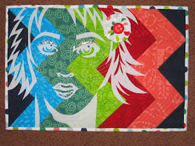
 The embellishments used were nail polish on the eyelids and the mouth, a rhinestone "nose piercing," a dot of navy matte fabric paint for the eye reflection and with the "theme" fabric I made a fabric yo-yo flower with large button center.
I needed to deviate from the group's size of 11.5" x16.5" to do the HST at 3" finished. My quilt will probably never be seen by any of the women in the group and I need to love the project to begin it so the finished size is 12" x 18."
I had so much fun I made a second one adding a small border for my local quilt guild's biennial quilt show April 25-26, 2015 using left over pastel batiks from the raffle quilt fabric scraps.

The same pattern and chevron placement but different colors. I do not work in pastels much so it was a fun change. This one is cute too!


Those Chevrons make great backgrounds for your portraits, also love how you chose your colours from your binding fabric and incorporated that in the yo yo in her hair too.
ReplyDeleteI'll never look at chevrons again without thinking of you. Love your interpretation of the "structure" theme.
ReplyDeleteI love that I recognize your work as YOURS! Always a portrait and always right on the mark! Beautiful piece!
ReplyDeleteTruly artist interpretation of the theme. Love your use of colour.
ReplyDeleteWhat a cool idea, Laurie!! Just perfect for the structure challenge!!!
ReplyDeleteI was wondering how you would work your signature portrait into this challenge. What you've done is perfect, love the chevrons and the colours you used.
ReplyDeleteGreat interpretation of structure, I really like this technique you have used and the blending of colours. You have nailed it.
ReplyDeleteLove it!
ReplyDeletefantastic background idea! And I also love that you did the piece in two color waves...completely different feel to them!
ReplyDeleteNothing left to say, it has all been said, I love it too...
ReplyDeleteYou inspire me to want to dip my toe into the pool of portraiture! Love it.
ReplyDeleteThe chevrons give a different feel to your portraits Laurie, I really like it. Can't decide whether I like your 1st or 2nd one best.
ReplyDeleteI love your idea! The chevron background is the PERFECT 'structure'
ReplyDelete